In a gaming landscape dominated by photorealism and ray tracing, low-poly design is quietly making a comeback. These minimal, angular environments—once the product of technical limitations—are now an aesthetic choice. And they’re resonating with a new wave of players.
Nostalgia Meets Modern Design

Image Credit: gamedeveloper.com
For many, the appeal of low-poly art starts with familiarity. It recalls the early days of 3D gaming—games on the Nintendo 64, the original PlayStation, or early PC builds. But it’s not just about looking backward. In a feature on Game Developer, designers explained how the style is being repurposed to create new experiences that feel both retro and experimental, not just nostalgic for its own sake.
Art Through Limitation
Image Credit: pixune.com
Working within visual constraints can push creativity. Low-poly art forces developers to think in shape, silhouette, and mood—without relying on texture or detail. A guide from Pixune Studios breaks down how strong use of color, contrast, and animation can make low-poly games visually distinct and emotionally expressive, even with minimal polygons.
Performance and Accessibility
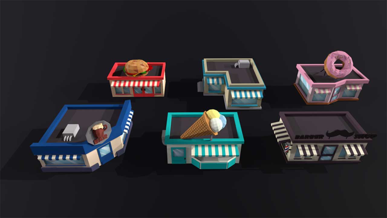
Image Credit: gamedeveloper.com
Lightweight models make low-poly games ideal for mobile platforms, indie devs, or underpowered machines. This style doesn’t require a high-end GPU to run well—and it often loads faster and feels smoother in motion. It also means smaller teams can bring games to market faster, with fewer resources.
Recent Games Leading the Way
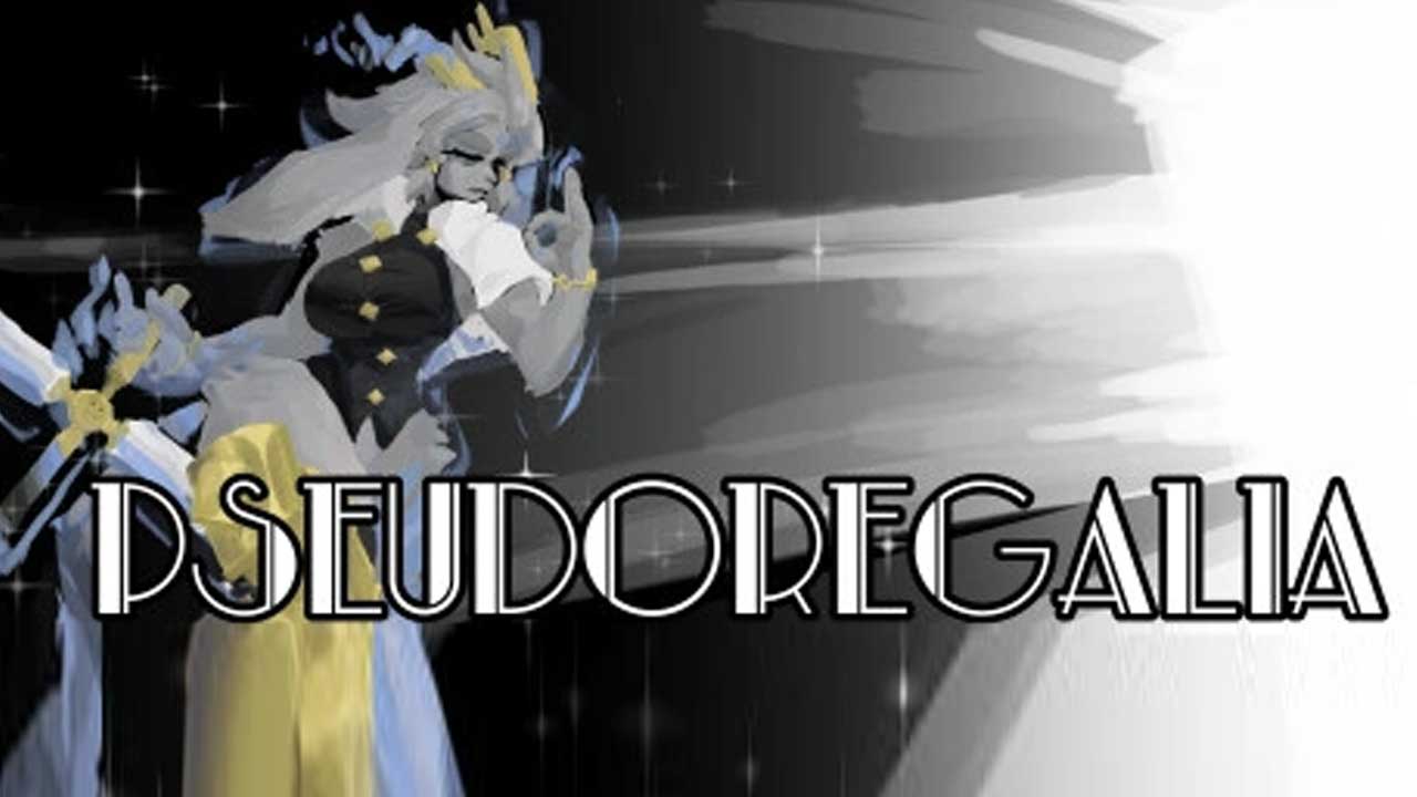
Image Credit: pseudoregalia.fandom.com
Several recent titles have helped define what modern low-poly can look like:
- Islanders – A city-building game that focuses on color and composition, not detail, for a calm and meditative experience.
- Pseudoregalia – A fast-paced 3D platformer that uses blocky geometry and soft lighting to create atmosphere on a budget.
Could This Be the Future of Game Art?
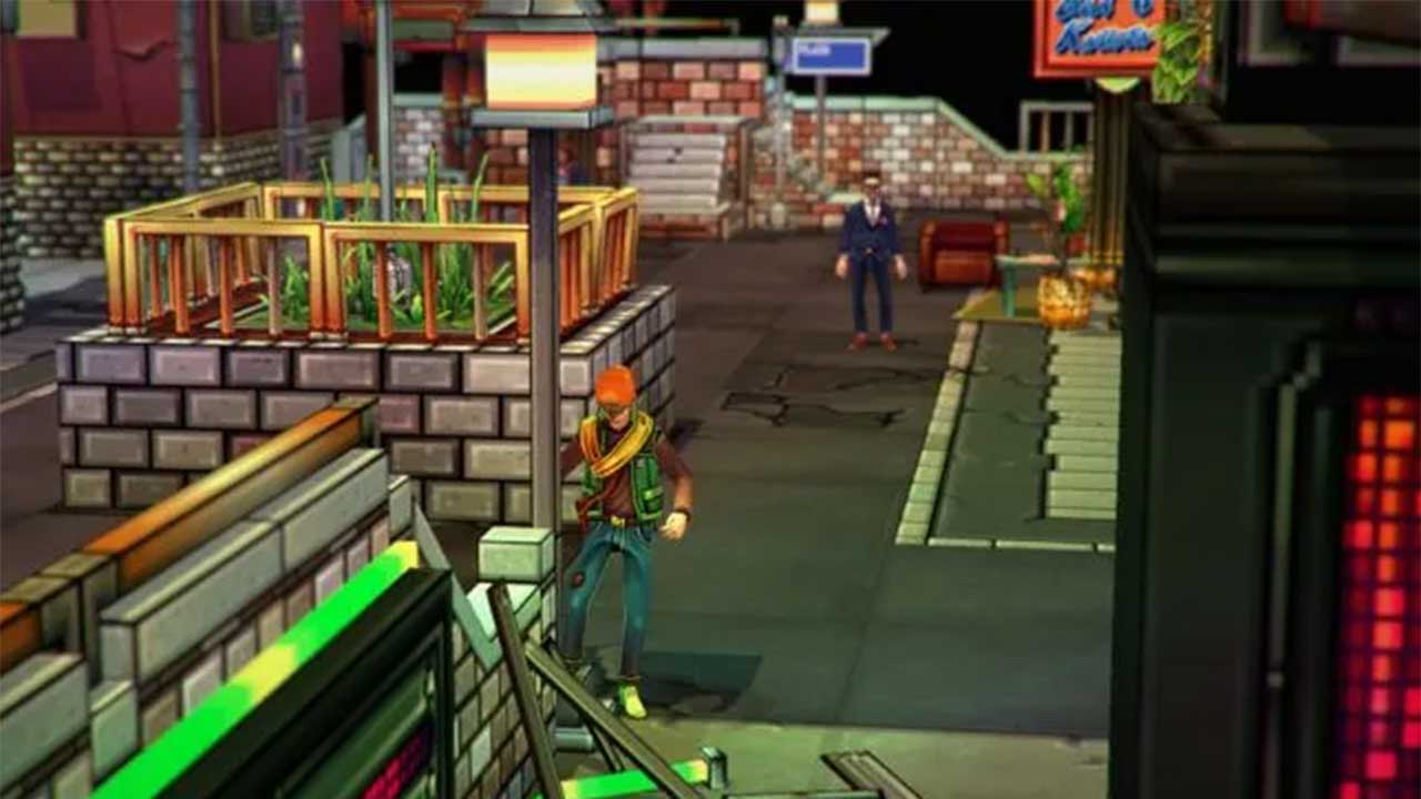
Image Credit: gamedeveloper.com
In an industry that sometimes chases realism at all costs, low-poly games offer something different: clarity, intention, and style. They remind us that graphics don’t have to be complex to be beautiful—and that sometimes, less really is more.
 By
By